Understanding content and scaffolding design
Creating a clear, filterable taxonomy for complex academic program offerings
The Problem
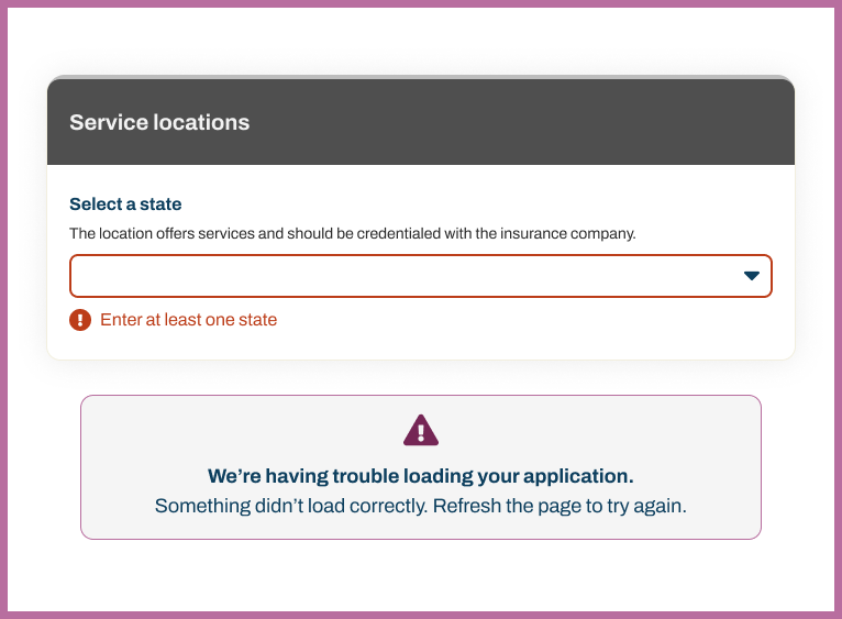
A healthcare company needed a digital transformation for a paper application to a digital format for providers. For the first phase, the focus is on structuring information for a vertical navigation approach
The Solution
I supported busines partners with getting the look and feel to translate to a 3rd-party content management system build.
The build started with a credentialing application so healthcare providers could join a larger network.
My Role & Impact
I led the information architecture strategy and content restructuring, conducting usability testing to understand how prospective students naturally categorized programs. I mapped the existing taxonomy, identified inconsistencies in how programs were labeled across the site, and proposed a scalable framework that could accommodate future program additions.
The redesign clarified the navigation for hundreds of program combinations, making it easier for non-traditional students—a key enrollment demographic for the institution—to find weekend, evening, and online pathways that fit their schedules.
The Transformation
Before
- Paper application that needed structuring for digital and AI future.
- Application order that supported processing and internal language.
- Unclear of information that's required vs. optional.
- Providers having confusion about accessing credentialing options with the inusrance provider.
After
- Three-dimensional taxonomy: Program Type × Mode of Study × Degree Type
- Give clear affordences to go back and forth in the application.
- Deepen specificity of labeling form fields on the application.
- Focus on restructuring the navigation elements for better sense-making
Design Principles
Start understanding what's a required question
Paper forms are often all open fields; ensuring clarity with required and optional questions drive the design.
Consistency Breeds Confidence
Using the same visual tagging system across all programs reduced cognitive load and built user confidence in navigating the site.
Design for busy professionals
There's often multi-tasking that providers and office administrators deal with. Keeping it simple with divided attention is the goal.